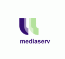
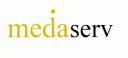
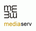
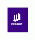
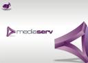
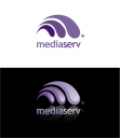
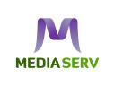
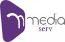
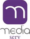
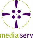
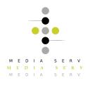
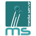
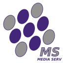
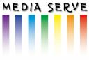
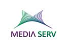
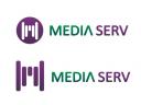
Logo design for Media buying services
Logo design for Media buying services
Contest Holder
Category
Logo Design
Contest Type
Public
Prize
500.00
Contest Start
July 25, 2008
Contest Length
30 days
Payments Method
Credit Card
Requested File Formats
Standard Web Formats (.jpg, .gif or .png)
Print Ready Vector Formats (.eps, .pdf or .ai)
Layered Formats (.psd or .tiff)
Print Ready Vector Formats (.eps, .pdf or .ai)
Layered Formats (.psd or .tiff)
Contest Tagline
-
Contest Summary
Logo design for Media buying services
Contest Description
orward thinking, technically advanced, proactive, intelligent, smart, fast, accurate. - business and ad agency owners - dark purple
Entries
-
 Unrated
 -
-
-
 Unrated
 -
 Unrated
 -

-
 Unrated
 -
 Unrated
 -
 Unrated
 -
 Unrated
 -
 Unrated
 -
 Unrated
 -
 Unrated
 -
 Unrated
 -
 Unrated
 -
 Unrated
 -
 Unrated
 -

-
 Unrated
 -
 Unrated
 -
 Unrated
 -
 Unrated
 -
 Unrated
 -
 Unrated
 -
 Unrated
 -
 Unrated
 -
 Unrated
 -
 Unrated
 -
 Unrated
 -
 Unrated
 -
 Unrated
 -
-
 Unrated
 -
 Unrated
 -
 Unrated
 -
 Unrated
 -
 Unrated
 -
 Unrated
 -
 Unrated
 -
 Unrated


Contest Forum
We offer unlimited Revisions with Options.
another try; please send comments
I believe the above examples aren't really what we are looking for ... keep in mind our colors. Dark purple and mossy green. If you let me know which color palette you use I will give you the corresponding number. If I had to narrow my word list it would be TECHNOLOGICALLY ADVANCE- FORWARD THINKING- EFFICIENT- AND LEADING EDGE.
Hi TheBigFish,
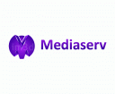
I like the icon, but I really don't understand what represents and how this is good for my bussines. I don't think that is suitable for my logo.
I like the icon, but I really don't understand what represents and how this is good for my bussines. I don't think that is suitable for my logo.
Hi xpressions ,
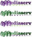
your "M" looks like a wave to me, and I don't think this is what I am looking for.
your "M" looks like a wave to me, and I don't think this is what I am looking for.
Hi titoandrade,
please read my previous message. I want somehing that says TECHNOLOGICALLY ADVANCE- FORWARD THINKING- EFFICIENT- AND LEADING EDGE, and your "M" doesn't says this.
please read my previous message. I want somehing that says TECHNOLOGICALLY ADVANCE- FORWARD THINKING- EFFICIENT- AND LEADING EDGE, and your "M" doesn't says this.
Hi AlliesServices,
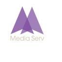
I had written down the approach and the concept along with my entry...
My concept and approach for the submission is the following...
The upward pointing triangle is sometimes called the blade (the blade figures in most of the ancient symbolisms). It is a symbol of aspiration or rising up, and of fire.
The triangle as a symbol (holy trinity;light/mass/energy;sound/form/substance) is a always a point of confluence. The delta, or meeting point of not just opposites but a synthesis point for new ideas. It is a universal symbol of continuum, of synthesis, movement, of fire and aspirations.
The open ends denote the limitless possibilities opening up in each domain. I’ve used parabolic curves and reshaped it as a triangle. The streamlined design indicates speed and focus...
A balanced logo using bold fonts with a streamlined mnemonic. The icon has a shadow effect to give it more depth and perspective so that it can be branded as an independent entity like a Nike, Apple or Cingular.
Best
John M
Hi xpressions,
thank you for sending another entry, but I don't think that this "M" is very good.
thank you for sending another entry, but I don't think that this "M" is very good.
Hi rdioogo,
I like your entries, you could work more on thisidea. Maybe another M?
I like your entries, you could work more on thisidea. Maybe another M?
Hi TheBigFish,
thank you for the detailed description of the icon; I agree with you, but I don't think that this icon is suitbale for may company - is too generic.
thank you for the detailed description of the icon; I agree with you, but I don't think that this icon is suitbale for may company - is too generic.
Is the company name 'MEDIASERV' as one word??
is this competition dead?