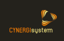
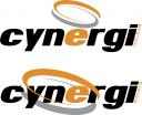
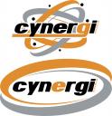
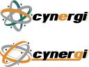
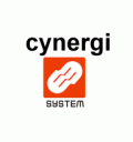
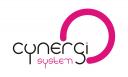
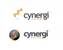
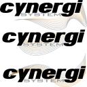
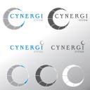
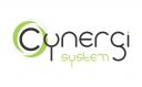
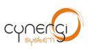
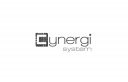
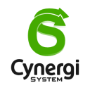
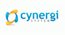
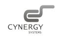
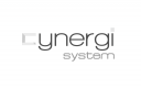
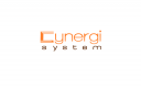
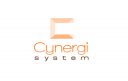
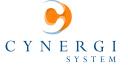
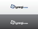
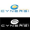
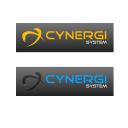
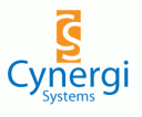
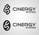
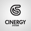
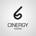
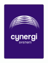
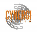
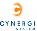
logo design for Cynergi System
modern looking logo
Contest Holder
Category
Logo Design
Contest Type
Public
Prize
650.00
Contest Start
July 23, 2008
Contest Length
12 days
Payments Method
Credit Card
PayPal
Western Union
Electronic Transfer
PayPal
Western Union
Electronic Transfer
Requested File Formats
Standard Web Formats (.jpg, .gif or .png)
Print Ready Vector Formats (.eps, .pdf or .ai)
Layered Formats (.psd or .tiff)
Print Ready Vector Formats (.eps, .pdf or .ai)
Layered Formats (.psd or .tiff)
Contest Tagline
modern looking logo.
Contest Summary
modern looking logo
Contest Description
Something that will look good on print. As far as colors are concerned, we like grey, blue, hunter green, and orange. We are going to use the logo on our website, buisness cards, letter heads, just about everything realy. Our target customer is small to mid sized buisness's. We are looking for something fairly simple, but very sharp and impressive. We don't want alot of colors in the logo. We basicly want the logo to make us look larger then we are.
Entries
-
 Unrated
 -
 Unrated
 -
-
 Unrated
 -
 Unrated
 -
 Unrated
 -
-
 Unrated
 -
 Unrated
 -
 Unrated
 -
 Unrated
 -
 Unrated
 -
 Unrated
 -
 Unrated
 -
 Unrated
 -
 Unrated
 -
 Unrated
 -
 Unrated
 -
 Unrated
 -
 Unrated
 -
 Unrated
 -
 Unrated
 -
 Unrated
 -
 Unrated
 -
 Unrated
 -
 Unrated
 -
-
 Unrated
 -
 Unrated
 -
 Unrated
 -
 Unrated
 -
 Unrated
 -
 Unrated
 -
 Unrated
 -
-
 Unrated
 -
 Unrated
 -
 Unrated
 -
 Unrated
 -
 Unrated
 -
 Unrated
 -
 Unrated
 -
 Unrated
 -
 Unrated
 -
-
 Unrated
 -
 Unrated
 -
 Unrated
 -
 Unrated
 -

-
 Unrated
 -
 Unrated
 -
 Unrated
 -
 Unrated


Contest Forum
Hi there, please find attached. Remember that all usage rights to final work will be transfered upon payment in full. We only retains the right to use the artwork for self promotion purposes as an example in my portfolios. If this is a problem, please let me know.
We make your images and words work wonders..
I used "C" & "S" , and a technical look. what dou you think?
We liked the Log Vogo logo on the second like the best, the one that looked kinda like a orange CD from drawardworks86, but none of them was what we where looking for. We prefer greens to compliment the orange. We also like blue's, and grey's if that helps you at all. We think we would like to see more concepts, and we very much approciate what you have done so far.
Offer logo & web design services
We liked the logo from Log Vogo on the second like the best, the one that looked kinda like a orange CD from drawardworks86, but none of them was what we where looking for. We prefer greens to compliment the orange. We also like blue's, and grey's if that helps you at all. We think we would like to see more concepts, and we very much approciate what you have done so far.
Offer logo & web design services
Offer logo & web design services
Freight Transportation and Logistics Company
Hi Monroy,
I think we could play with your first entry; it's says "energy", but remember I want an unique logo, and this one looks too common to me.
I think we could play with your first entry; it's says "energy", but remember I want an unique logo, and this one looks too common to me.
Freight Transportation and Logistics Company
My try.
The logo aims to show "connection" and "networking".
The logo aims to show "connection" and "networking".
Website, Graphic and Animation Creation
Hi rdioogo,
your logos are clean and simple. I like that, but I don't think that those logos suggest "energy".
your logos are clean and simple. I like that, but I don't think that those logos suggest "energy".
Freight Transportation and Logistics Company
hi xpressions,
the icon is too complicated, you could barely see what the icon represents.
the icon is too complicated, you could barely see what the icon represents.
Freight Transportation and Logistics Company
Hi Monroy,
much better but still is not what I am looking for.
much better but still is not what I am looking for.
Freight Transportation and Logistics Company
Hi LPcreative,
I don't understand your design. what represents the icon?
I don't understand your design. what represents the icon?
Freight Transportation and Logistics Company
The icon represents revolving acceleration shown in a shape of a "c"
Creative Designer | www.LPcreative.net
LitmusStudio's logo is exactly the same as the squarespace logo. :/
http://www.squarespace.com/
http://www.squarespace.com/
feedback?
Hi rdioogo,
Sorry, but I don't see any improvement; the first one looks better
Sorry, but I don't see any improvement; the first one looks better
Freight Transportation and Logistics Company
Sorry Neslow, but I don't see any motion in your logo.
Freight Transportation and Logistics Company
Hi Neslow, it's a moon in your logo? I know you used the "C" from the company name, but I really see a moon there.
Freight Transportation and Logistics Company
Hi typenerd, I like your idea, but the icon is too crowded, you cannot see exactly what the icon represents.
Freight Transportation and Logistics Company
Hi ErnestoMagliacano,
your logo is too familiar to me; this kind of logo can be seen in many cases; I want something, modern, unique and that represents my bussines.
your logo is too familiar to me; this kind of logo can be seen in many cases; I want something, modern, unique and that represents my bussines.
Freight Transportation and Logistics Company
Hi cgrein,
I like your ideea, but this is just a sketch; this need a lot of work,
I like your ideea, but this is just a sketch; this need a lot of work,
Freight Transportation and Logistics Company
Hi Rumiee,
not bad, it is clean and simple, but I don't like what is behind the "C".
not bad, it is clean and simple, but I don't like what is behind the "C".
Freight Transportation and Logistics Company
Hi ebetiene: any feedback is appreciated. Thank you
Zipo Design
Hi guys, I will go with drawardworks86. I think his logo is simple, modern and reflects some kind of movement.
Freight Transportation and Logistics Company